Meet Cristina
I've been working a ton on the University Project, specifically putting together bios of each of the students for whom we'll be looking for sponsors. This is what I have so far and I'd like to get some opinions since I'm new at this whole design thing. There are some things I don't think look good and some things I do, and I'm looking to find out what things I could make better and what I should leave alone.
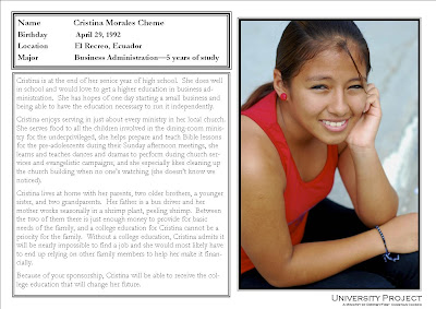
This first one is the actual Bio Card. It will be the first thing someone sees, kind of introducing them to a student. It's a half-sheet size, with the student info on the front and a little more info on the back.
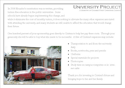
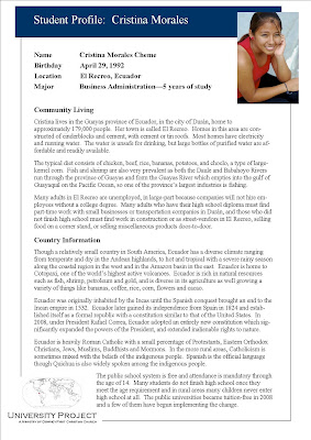
This next sheet is more of a background info page. It shares a bit about the community and the country in which the student lives. And on the back are a few maps of the area where the student is.

So, your constructive input is appreciated! What looks good, what looks wierd? What makes you interested? What is distracting? Thank you for your help!!
This first one is the actual Bio Card. It will be the first thing someone sees, kind of introducing them to a student. It's a half-sheet size, with the student info on the front and a little more info on the back.


This next sheet is more of a background info page. It shares a bit about the community and the country in which the student lives. And on the back are a few maps of the area where the student is.


So, your constructive input is appreciated! What looks good, what looks wierd? What makes you interested? What is distracting? Thank you for your help!!
posted by Amy at 2:02 PM
![]()

4 Comments:
without actually reading anything on the card because I am lazy, I would say, as a lazy person, that there is a lot to read on there. On the half sheet Bio, I would say less verbage would be good. Put the few heartstring and inspiring lines about Cristina that would invite a prospective donor to want to know more about her, to which you could offer more info at that time. Does that make sense? but like I said, I didn't actually read the card yet.
Now I actually read the half-sheet and you have good stuff, but I think we (will you let me play with it?) can apply the less-is-more makeover to it and really punch people with it.
The bio card is perfect, just change the font. The Student Profile, I would change it to a Get to Know Ecuador and take everything about her out and just make it about the country. The diet thing could go in the country information. Maybe break it up into sub sections with a bold heading for each section such as climate, food, living conditions. The third paragraph in the top should be your lead paragraph as that is your seller and then you give the other country info that's less important with the maps at the bottom. Oh and you do have a mistake in the bottom section when you mention about religions. Where you have Mormons, that's actually incorrect as the official name of the church is The Church of Jesus Christ of Latter-day Saints. Mormon is a nickname picked up from The Book of Mormon and actually was a derogatory term when first used. Over the years as the church pressed on to continue to be Christ-like it's turned around and become positive. Just a little church history for ya. Are these for the website or are these things you would send through the mail? The way you have them designed, it could be both and that would be great as it would unify your look and make you look that much more professional and come across to people like you are serious and trustworthy and image means a lot in something like this.
thanks a lot for the input everybody! it was really helpful! we made some changes and are looking forward to presenting what we have.
Post a Comment
<< Home